I had planned to make Tutorial Tuesday a weekly feature but I became brain-dead on what to create a tutorial about that you can't already find on 300 other blogs. BUT that's okay, because I have a good one for ya today!
First, I want to say that I LOVE LOVE LOVE Passionfruit Ads. If you have lived under a rock the last few months and haven't heard about it, please check them out! If you are a Blogger who accepts sponsors, it's invaluable, really. Once of my favorite things to do is peruse the Passionfruit Directory to find new blogs to read, follow, and sponsor. I've found a lot of great blogs on there that I may not have come across as soon otherwise. Jason: you rock!
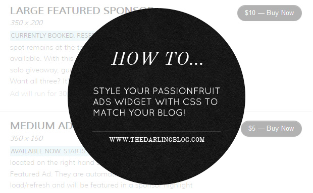
Anyway. While I LOVE Passionfruit, it slightly bothered me that there wasn't an option to change the colors of the widget that displays the purchase button and things. Being the designer that I am, I like to have things match, you know. Yesterday, I started to really think about it and used the handy-dandy Firebug plugin to find the classes used in the widget and voila! It worked like a charm. As you can see on my Sponsor page, it now looks like the image above.
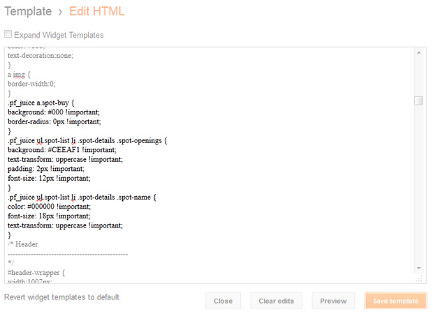
To style your own, just copy and paste the classes below into your CSS. If you don't want to change something, just delete that line. Let me know if you have any questions! The CSS below is just a sample... you can, of course, change the color and size, add a background color, padding, etc. Just don't remove the !important tag or it may not work. You want your custom CSS to override the CSS that Passionfruit pulls in automatically and that's what !important is for.
/**** SPONSOR SPOT TITLE ****/
.pf_juice ul.spot-list li .spot-details .spot-name {
font-size: 14px !important:
color: #000000 !important;
}
/**** BUY NOW BUTTON ****/
.pf_juice a.spot-buy {
background-color: #000000 !important;
}
/**** AVAILABLE SPOTS TEXT ****/
.pf_juice ul.spot-list li .spot-details .spot-openings {
font-size: 14px !important;
color: #000000 !important;
}
This is just a basic overview that should give you a pretty good idea of how you can style it to match your blog a bit better. If you have Firefox, download the Firebug plugin to find the classes on other parts of the widget as well. You can go into as much or as little detail as you want! I didn't want to change the look up too much, but the hot pink buttons against my gray and light blue design were killing me, haha. :)
Just for reference, here's what my CSS looks like:

Thanks for this! I've been following PFA on twitter for a while now and have been meaning to check them out. This is a push in the right directions for me AND now I know that I can tailor it to fit my blog theme.
ReplyDeleteAwesome! Definitely saving this for the future, thanks for sharing.
ReplyDeletethanks for this tutorial!
ReplyDeleteI will definitely keep it in mind for the future!
YOU have a wonderful day!
;)
This is so helpful! Thanks for posting this, will be using as reference in the future :)
ReplyDeletexx
This is great! Thanks!
ReplyDeletefantastic. totally just used it! awesome job! ;)
ReplyDelete